1.开发工具的下载
DevEco Studio-HarmonyOS Next Beta版-华为开发者联盟
 安装、环境配置时,建议 自定义目录
注意:路径中不要有 中文、特殊字符。2.ArkTS基础总结
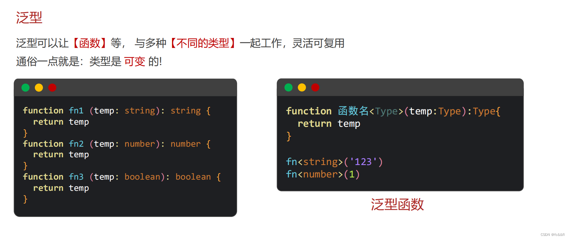
1)三种数据类型
① string 字符串:描述信息② number 数字:计算③ boolean 布尔:判断 (真、假)2)数组,函数,对象
Person ={name: ' 杨幂 ' ,age: 18 ,weight: 90}接口(属性)
interface Person {name : stringage : numberweight : number}接口(方法)interface Person {dance : () => voidsing : ( song: string ) => void}联合类型
let judge : number | string = 100枚举类型
enum Theme Color {Red = '#ff0f29' ,Orange = '#ff7100' ,Green = '#30b30e'}ArkTS其实就是ts的超集,而且一般用的就是js
3. 界面开发起步
1)log里面看console.log输出的内容
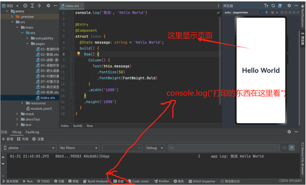
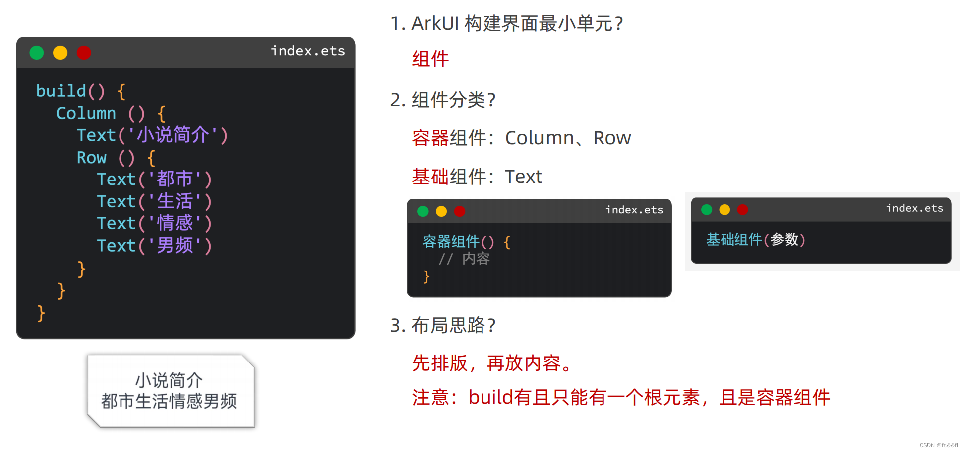
2) 鸿蒙里面没有html的body,div,有的只是row(),column(),还有image,button一类的和html差不多的组件,就像vue2里面你要有一个最大的div块一样,你要保证你的build()里面有一个column(),然后往里面可以继续放column()和row(),然后row()和column()里面可以放text()和image()等等
3)给column()组件加方法,比如说控制它的高度,宽度什么的,需要下面这样写
,每个组件的具体属性需要自己去搜,和html差不多,高度长度,字体大小一类的,还有padding,margin,border
    Column() {
Text('123').width()
.height()
      }
      .width('100%')
      .layoutWeight(1) // 让容器高度自适应
.backgroundColor(Color.Orange)4)设置文字溢出省略号
Text('方舟...')
.textOverflow({
overflow: TextOverflow.Ellipsis
 })
 .maxLines(2)
 .lineHeight(30)
5)Image组件两种用法,一般用svg文件,可放大缩小不失真
网络图片
Image(‘https://............)
本地图片
你要把图片放在指定的目录里
main---->resources---->base---->media
Image($r('app.media.product))
6)给容器之间加间隔,可以下面这样写,这也是与html不一样的地方,方便了很多
如何调整组件之间的距离?
给外层容器组件加 { space: 数字 }

Column({space:20}){
Text()
Button()
}
这样text和button就会有20px的间隔
7)圆角,正圆和胶囊
  Column() {
      // 1. 正圆 (头像)
      Image($r('app.media.cat'))
        .width(100)
        .height(100)
        .borderRadius(50)

      // 2. 胶囊按钮 (左右半圆)
      Text('今天还没打卡呦~')
        .width(240)
        .height(60)
        .borderRadius(30)
        .backgroundColor(Color.Pink)
        .margin({ top: 20 })
    }
    .padding(20)
8)背景多了一些新的东西
 // backgroundImagePosition
    // 1. 传入对象, 设置位置坐标,背景图片的左顶点
    //    { x: 坐标值, y: 坐标值 }
    //    注意:坐标值的单位,和宽高的默认单位不同的,显示出来大小会不同
    //
    // 2. Alignment 枚举,设置一些特殊的位置(中央、左顶点...)
    //    Center  TopStart左顶点 TopEnd右顶点 BottomEnd右下...


      Text()
        .width(300)
        .height(200)
        .backgroundColor(Color.Pink)
        .backgroundImage($r('app.media.flower'))
        .backgroundImagePosition({
          x: 400,
          y: 300
        })
        .backgroundImagePosition(Alignment.BottomEnd)
    }
    .padding(20)
9)这里引出来一个新的单位,不是px,是vp
px转换为vp的方法vp2px
 Text()
        .width('300vp')
        .height('200vp')
        .backgroundColor(Color.Pink)
        .backgroundImage($r('app.media.flower'))
        .backgroundImagePosition({
          x: vp2px(150),
          y: vp2px(100)
        })
    }
    .padding(20)
10)主轴对齐方式(column和row都可以为主轴),这里和flex差不多,它这里面也还可以引入flex,grid
    Column() {
      Text()
        .width(200).height(100)
        .backgroundColor(Color.Pink)
        .border({ width: 2 })
      Text()
        .width(200).height(100)
        .backgroundColor(Color.Pink)
        .border({ width: 2 })
        .margin(5)
      Text()
        .width(200).height(100)
        .backgroundColor(Color.Pink)
        .border({ width: 2 })
        .margin(5)
      Text()
        .width(200).height(100)
        .backgroundColor(Color.Pink)
        .border({ width: 2 })
    }
    .width('100%')
    .height('100%')
    .backgroundColor('#ccc')
    // 设置排布主方向的对齐方式(主轴)
    // 1. Start  (排布主方向)主轴起始位置对齐
    // 2. Center  主轴居中对齐
    // 3. End     主轴结束位置对齐
    // 4. SpaceBetween 贴边显示,中间的元素均匀分布间隙
    // 5. SpaceAround 间隙环绕  0.5  1  1  1  0.5 的间隙分布,靠边只有一半的间隙
    // 6. SpaceEvenly 间隙均匀环绕,靠边也是完整的一份间隙
    // justifyContent(枚举FlexAlign)  ctrl+p  cmd+p
    // .justifyContent(FlexAlign.Center)
    // .justifyContent(FlexAlign.SpaceBetween)
    // .justifyContent(FlexAlign.SpaceAround)
    .justifyContent(FlexAlign.SpaceEvenly)
11)交叉轴对齐方式
build() {
    // Column 交叉轴的对齐方式(水平往右)
    // alignItems(HorizontalAlign.Start)  Center End
    Column() {
      Text()
        .width(200).height(100)
        .backgroundColor(Color.Pink)
        .border({ width: 2 })
      Text()
        .width(200).height(100)
        .backgroundColor(Color.Pink)
        .border({ width: 2 })
        .margin({ top: 5, bottom: 5 })
      Text()
        .width(200).height(100)
        .backgroundColor(Color.Pink)
        .border({ width: 2 })
    }
    .alignItems(HorizontalAlign.End)
    .width('100%')
    .height('100%')
    .backgroundColor('#ccc')
12)layoutWeight 自适应伸缩: 按照[份数权重],分配[剩余空间]
    Column() {
      // layoutWeight 自适应伸缩: 按照[份数权重],分配[剩余空间]
      Row() {
        Text('左侧')
          .layoutWeight(1)
          .height(40)
          .backgroundColor(Color.Pink)
        Text('右侧固定')
          .width(80)
          .height(40)
          .backgroundColor(Color.Orange)
      }
      .width(300)
      .height(40)
      .backgroundColor('#fff')

      Row() {
        Text('老大')
          .layoutWeight(1)
          .height(40)
          .backgroundColor(Color.Gray)
        Text('老二')
          .layoutWeight(2)
          .height(40)
          .backgroundColor(Color.Orange)
        Text('老三')
          .layoutWeight(3)
          .height(40)
          .backgroundColor(Color.Pink)
        Text('小宝')
          .width(50)
          .height(40)
          .backgroundColor(Color.Brown)
      }
      .width(300)
      .height(40)
      .backgroundColor('#fff')
      .margin({ top: 30 })

    }
    .padding(10)
    .width('100%')
    .height('100%')
    .backgroundColor('#ccc')
13)flex
  // Flex默认主轴水平往右,交叉轴垂直往下 → Row
    // 1. 主轴方向
    //    direction: FlexDirection.Row / Column
    // 2. 主轴对齐方式
    //    justifyContent: FlexAlign.SpaceAround
    // 3. 交叉轴对齐方式
    //    alignItems: ItemAlign.Stretch / Start / Center / End
    // 单行或者单列的情况,优先还是使用线性布局(本质基于Flex设计的,且还做了性能优化)

    // Flex布局:伸缩布局。当子盒子的总和溢出父盒子,默认进行压缩显示。
    // 4. 换行 wrap
    //    FlexWrap.Wrap 换行
    //    FlexWrap.NoWrap 不换行
    Flex({
      wrap: FlexWrap.Wrap
    }) {
      Text()
        .width(80).height(80)
        .backgroundColor(Color.Pink)
        .border({ width: 1, color: Color.Blue })
      Text()
        .width(80).height(80)
        .backgroundColor(Color.Pink)
        .border({ width: 1, color: Color.Blue })
      Text()
        .width(80).height(80)
        .backgroundColor(Color.Pink)
        .border({ width: 1, color: Color.Blue })
      Text()
        .width(80).height(80)
        .backgroundColor(Color.Pink)
        .border({ width: 1, color: Color.Blue })
      Text()
        .width(80).height(80)
        .backgroundColor(Color.Pink)
        .border({ width: 1, color: Color.Blue })
    }
    .width(300)
    .height(300)
    .backgroundColor('#5f9a5c')
14)绝对定位和zindex
   // position绝对定位:可以控制组件位置,可以实现层叠效果
    // 语法:
    // .position({
    //   x: 50,
    //   y: 50
    // })
    // 特点:
    // 1. 相对于父组件左顶点进行偏移(调整位置)
    // 2. 原本的位置不占了,且可以任意调整位置,不影响其他元素

    // 后面的组件明显层次更高,会盖住前面的组件
    // 需求:不动结构的情况下,调整组件的层级 .zIndex(数字)
    Column() {

      Text('大儿子')
        .width(80)
        .height(80)
        .backgroundColor(Color.Green)
        .zIndex(3)
      Text('二儿子定位')
        .width(80)
        .height(80)
        .backgroundColor(Color.Yellow)
        .position({
          x: 50,
          y: 50
        })
        .zIndex(4)
      Text('三儿子')
        .width(80)
        .height(80)
        .backgroundColor(Color.Orange)
        .zIndex(2)
    }
    .width(300)
    .height(300)
    .backgroundColor(Color.Pink)
15)层叠布局
 // 层叠布局
    Stack({
      alignContent: Alignment.Bottom
    }) {
      Text('大儿子')
        .width(250)
        .height(250)
        .backgroundColor(Color.Green)
        .zIndex(3)
      Text('二儿子')
        .width(150)
        .height(150)
        .backgroundColor(Color.Orange)
        .zIndex(4)
      Text('三儿子')
        .width(50)
        .height(50)
        .backgroundColor(Color.Yellow)
        .zIndex(5)
    }
    .width(300)
    .height(600)
    .backgroundColor(Color.Pink)
下面是前端的一个综合示例:B站-视频卡片
@Entry
@Component
struct Index {
  build() {
    Column() {
      // b站视频卡片
      Column() {
        // 1. 上面图片区域(层叠布局)
        Stack({ alignContent: Alignment.Bottom }) {
          Image($r('app.media.bz_img'))
            .borderRadius({
              topLeft: 10,
              topRight: 10
            })
          Row() {
            Row({ space: 5 }){
              Image($r('app.media.bz_play'))
                .width(14)
                .fillColor(Color.White)
              Text('288万')
                .fontSize(12)
                .fontColor(Color.White)
            }
            .margin({ right: 10 })
            Row({ space: 5 }){
              Image($r('app.media.bz_msg'))
                .width(14)
                .fillColor(Color.White)
              Text('8655')
                .fontSize(12)
                .fontColor(Color.White)
            }

            Blank()

            Text('4:33')
              .fontSize(12)
              .fontColor(Color.White)
          }
          .height(24)
          .padding({ left: 5, right: 5 })
          .width('100%')
        }
        .width('100%')
        .height(125)

        // 2. 底部文字区域
        Column() {
          Text('【凤凰传奇新歌】欢迎来到国风统治区:唢呐一响神曲《铁衣流派推广曲》')
            .fontSize(13)
            .lineHeight(16)
            .textOverflow({ overflow: TextOverflow.Ellipsis })
            .maxLines(2)
          Row() {
            Text('19万点赞')
              .fontSize(10)
              .fontColor('#e66c43')
              .backgroundColor('#fef0ef')
              .padding(5)
              .borderRadius(2)
            Image($r('app.media.bz_more'))
              .width(14)
          }
          .margin({ top: 6 })
          .width('100%')
          .justifyContent(FlexAlign.SpaceBetween)
        }
        .padding(5)
      }
      .width(200)
      .height(200)
      .backgroundColor(Color.White)
      .borderRadius(10)
      .margin({ top: 10 })
    }
    .width('100%')
    .height('100%')
    .backgroundColor('#ccc')
  }
}
4.上面说了一些前端的部分,下面说一下后端部分
1)字符串拼接+模板字符串的用法
用``还有${}
// let hobby: string = '打拳'
// console.log('简介信息', `姓名: ${name}, 年纪: ${age}岁, 爱好: ${hobby}`)
2)一些js的基础知识
1)数字转字符串
// 将数字转字符串, toString()  toFixed()
// 1. 数据.toString() 原样转字符串
console.log('toString:', money.toString())

// 2. 数据.toFixed(保留几位小数)  四舍五入
console.log('toFixed:', money.toFixed())
console.log('toFixed:', money.toFixed(2))
2)点击事件还是onclick
      Text('我是文本')
          .onClick(() => {
            // 弹个框
            AlertDialog.show({
              message: '你好~ 我是文本组件'
            })
          })
3)鸿蒙多了一个状态变量
普通变量:只能在初始化时渲染,后续将不会再刷新。
状态变量:需要装饰器装饰,改变会引起 UI 的渲染刷新 (必须设置 类型 和 初始值)
struct Index {
  // 组件内的[普通变量] this.xxx
  myAge: number = 18

  // 组件内的[状态变量] this.xxx
  @State myMsg: string = 'hello 黑马'

  build() {
    Column() {
      Text(myName).onClick(() => {
        myName = '貂蝉'
        console.log('myName', myName)
      })
      Text(this.myAge.toString()).onClick(() => {
        this.myAge = 200
        console.log('myAge', this.myAge)
      })
      Text(this.myMsg).onClick(() => {
        this.myMsg = '你好 状态'
      })
    }
  }
}
简单后端的例子:抽卡
// 定义接口 (每个列表项的数据结构)
interface ImageCount {
  url: string
  count: number
}

// 0 1 2 3 4 5
// [0,1) * 6  =>  [0,6)
// 求随机数: Math.random
// 向下取整: Math.floor
// console.log('随机数', Math.floor(Math.random() * 6))

@Entry
@Component
struct Index {
  // 随机的生肖卡序号 0-5
  @State randomIndex: number = -1 // 表示还没开始抽

  // 基于接口, 准备数据
  @State images: ImageCount[] = [
    { url: 'app.media.bg_00', count: 0 },
    { url: 'app.media.bg_01', count: 0 },
    { url: 'app.media.bg_02', count: 0 },
    { url: 'app.media.bg_03', count: 0 },
    { url: 'app.media.bg_04', count: 0 },
    { url: 'app.media.bg_05', count: 0 }
  ]

  // 控制遮罩的显隐
  @State maskOpacity: number = 0 // 透明度
  @State maskZIndex: number = -1 // 显示层级

  // 控制图片的缩放
  @State maskImgX: number = 0 // 水平缩放比
  @State maskImgY: number = 0 // 垂直缩放比

  // 控制中大奖遮罩的显隐
  @State isGet: boolean = false

  @State arr: string[] = ['pg', 'hw', 'xm'] // 奖池
  @State prize: string = '' // 默认没中奖

  build() {
    Stack() {
      // 初始化的布局结构
      Column() {
        Grid() {
          ForEach(this.images, (item: ImageCount, index: number) => {
            GridItem() {
              Badge({
                count: item.count,
                position: BadgePosition.RightTop,
                style: {
                  fontSize: 14,
                  badgeSize: 20,
                  badgeColor: '#fa2a2d'
                }
              }) {
                Image($r(item.url))
                  .width(80)
              }
            }
          })
        }
        .columnsTemplate('1fr 1fr 1fr')
        .rowsTemplate('1fr 1fr')
        .width('100%')
        .height(300)
        .margin({ top: 100 })

        Button('立即抽卡')
          .width(200)
          .backgroundColor('#ed5b8c')
          .margin({ top: 50 })
          .onClick(() => {
            // 点击时, 修改遮罩参数, 让遮罩显示
            this.maskOpacity = 1
            this.maskZIndex = 99
            // 点击时, 图片需要缩放
            this.maskImgX = 1
            this.maskImgY = 1

            // 计算随机数 Math.random()  [0,1) * (n + 1)
            this.randomIndex = Math.floor(Math.random() * 6)
          })
      }
      .width('100%')
      .height('100%')

      // 抽卡遮罩层 (弹层)
      Column({ space: 30 }) {
        Text('获得生肖卡')
          .fontColor('#f5ebcf')
          .fontSize(25)
          .fontWeight(FontWeight.Bold)
        Image($r(`app.media.img_0${this.randomIndex}`))
          .width(200)
            // 控制元素的缩放
          .scale({
            x: this.maskImgX,
            y: this.maskImgY
          })
          .animation({
            duration: 500
          })
        Button('开心收下')
          .width(200)
          .height(50)
          .backgroundColor(Color.Transparent)
          .border({ width: 2, color: '#fff9e0' })
          .onClick(() => {
            // 控制弹层显隐
            this.maskOpacity = 0
            this.maskZIndex = -1

            // 图像重置缩放比为 0
            this.maskImgX = 0
            this.maskImgY = 0

            // 开心收下, 对象数组的情况需要更新, 需要修改替换整个对象
            // this.images[this.randomIndex].count++
            this.images[this.randomIndex] = {
              url: `app.media.img_0${this.randomIndex}`,
              count: this.images[this.randomIndex].count + 1
            }

            // 每次收完卡片, 需要进行简单的检索, 判断是否集齐
            // 需求: 判断数组项的count, 是否都大于0, 只要有一个等于0,就意味着没集齐
            let flag: boolean = true // 假设集齐

            // 验证是否集齐
            for (let item of this.images) {
              if (item.count == 0) {
                flag = false // 没集齐
                break // 后面的没必要判断了
              }
            }

            this.isGet = flag

            // 判断是否中奖了, 如果是 需要抽奖
            if (flag) {
              let randomIndex: number = Math.floor(Math.random() * 3)
              this.prize = this.arr[randomIndex]
            }
          })
      }
      .justifyContent(FlexAlign.Center)
      .width('100%')
      .height('100%')
      // 颜色十六进制色值,如果是八位,前两位,就是透明度
      .backgroundColor('#cc000000')
      // 设置透明度
      .opacity(this.maskOpacity)
      .zIndex(this.maskZIndex)
      // 动画 animation, 当我们元素有状态的改变,可以添加animation做动画
      .animation({
        duration: 200
      })

      // 抽大奖的遮罩层
      if (this.isGet) {
        Column({ space: 30 }) {
          Text('恭喜获得手机一部')
            .fontColor('#f5ebcf')
            .fontSize(25)
            .fontWeight(700)
          Image($r(`app.media.${this.prize}`))
            .width(300)
          Button('再来一次')
            .width(200)
            .height(50)
            .backgroundColor(Color.Transparent)
            .border({ width: 2, color: '#fff9e0' })
            .onClick(() => {
              this.isGet = false
              this.prize = ''
              this.images = [
                { url: 'app.media.bg_00', count: 0 },
                { url: 'app.media.bg_01', count: 0 },
                { url: 'app.media.bg_02', count: 0 },
                { url: 'app.media.bg_03', count: 0 },
                { url: 'app.media.bg_04', count: 0 },
                { url: 'app.media.bg_05', count: 0 }
              ]
            })
        }
        .justifyContent(FlexAlign.Center)
        .width('100%')
        .height('100%')
        .backgroundColor('#cc000000')
      }
    }

  }
}
5.轮播swiper组件
最简单的例子
 Column() {
      // Swiper 轮播组件的基本使用
      // 1. Swiper 包内容
      // 2. Swiper 设尺寸
      Swiper() {
        Text('1')
          .backgroundColor(Color.Orange)
        Text('2')
          .backgroundColor(Color.Yellow)
        Text('3')
          .backgroundColor(Color.Brown)
      }
      .width('100%')
      .height(100)

      Swiper() {
        Image($r('app.media.ic_swiper_xmyp01'))
        Image($r('app.media.ic_swiper_xmyp02'))
        Image($r('app.media.ic_swiper_xmyp03'))
        Image($r('app.media.ic_swiper_xmyp04'))
      }
      .width('100%')
      .height(150)
    }
常见属性
      .loop(true) // 开启循环
      .autoPlay(true) // 自动播放
      .interval(5000) // 自动播放间隔
      .vertical(true) // 纵向
// 定制小圆点
      // .indicator(false)
      .indicator(
        Indicator.dot()
          .itemWidth(20)
          .itemHeight(20)
          .color(Color.Black)
          .selectedItemWidth(25)
          .selectedItemHeight(25)
          .selectedColor(Color.White)
      )
完整代码
@Entry
@Component
struct Index {
  build() {
    Column() {
      // 1. Swiper轮播容器 (填入内容)
      Swiper() {
        Image($r('app.media.1')).objectFit(ImageFit.Cover)
        Image($r('app.media.2')).objectFit(ImageFit.Cover)
        Image($r('app.media.3')).objectFit(ImageFit.Cover)
        Image($r('app.media.4')).objectFit(ImageFit.Cover)
        Image($r('app.media.5')).objectFit(ImageFit.Cover)
      }
      // 2. 设置尺寸
      .width('100%').height('100%')

      // 3. 定制方向和小圆点
      .vertical(true) // 纵向轮播
      .indicator(
        Indicator.dot() // 小圆点样式
          .color(Color.White)
          .selectedColor(Color.Orange)
      )
    }
  }
}
6.@Extend-扩展组件(样式,事件)
@Extend(Text)
function textExtend(color: ResourceColor, txt: string) {
.textAlign(TextAlign.Center)
.backgroundColor(color)
.fontColor(Color.White)
.fontSize(30)
.onClick(() => {
AlertDialog.show({
message: txt
})
})
}
Text('1')
.textExtend(Color.Red, '轮播图1')7.@Styles: 抽取通用属性、事件
// 1. 全局定义
@Styles function commonStyles() {
.width(100)
.height(100)
.onClick(()=>{ })
}
@Component
struct FancyDemo {
// 2. 在组件内定义
 @Styles setBg() {
.backgroundColor(this.Color)
}
builder(){
Text()
 .commonStyles()
.setBg()
}
}8.@Builder:自定义构建函数(结构、样式、事件)
类似于vue里面的混入(Mixins)
// 全局 Builder
@Builder
function navItem(icon: ResourceStr, txt: string) {
  Column({ space: 10 }) {
    Image(icon)
      .width('80%')
    Text(txt)
  }
  .width('25%')
  .onClick(() => {
    AlertDialog.show({
      message: '点了' + txt
    })
  })
}


@Entry
@Component
struct BuilderDemo {
  @State message: string = '@Builder';

  @Builder
  navItem(icon: ResourceStr, txt: string) {
    Column({ space: 10 }) {
      Image(icon)
        .width('80%')
      Text(txt)
    }
    .width('25%')
    .onClick(() => {
      AlertDialog.show({
        message: '点了' + txt + this.message
      })
    })
  }

  build() {
    Column({ space: 20 }) {
      Text(this.message)
        .fontSize(30)

      Row() {
        Row() {
          navItem($r('app.media.ic_reuse_01'), '阿里拍卖')
          navItem($r('app.media.ic_reuse_02'), '菜鸟')
          this.navItem($r('app.media.ic_reuse_03'), '巴巴农场')
          this.navItem($r('app.media.ic_reuse_04'), '阿里药房')
        }
      }
    }
    .width('100%')
    .height('100%')
  }

}9.滚动容器 Scroll
@Entry
@Component
struct Index {
  build() {
    Column() {
      // 如果希望内容溢出, 能够滚动
      Scroll() {
        Column({ space: 10 }) {
          ForEach(Array.from({ length: 10 }), (item: string, index) => {
            Text('测试文本' + (index + 1))
              .width('100%')
              .height(100)
              .textAlign(TextAlign.Center)
              .backgroundColor(Color.Orange)
              .fontSize(20)
              .fontColor(Color.White)
              .borderRadius(10)
          })
        }
        .padding(10)
        .width('100%')
      }
      .width('100%')
      .height(400)
      .scrollable(ScrollDirection.Vertical) // 设置滚动方向
      .scrollBar(BarState.Auto) // On一直显示 Off一直隐藏 Auto滑动显示
      .scrollBarColor(Color.Blue) // 滚动条颜色
      .scrollBarWidth(5) // 滚动条宽度
      .edgeEffect(EdgeEffect.Spring) // 滑动效果
    }
  }
}10.容器组件 Tabs
@Entry
@Component
struct Index {
  build() {
    Tabs({ barPosition: BarPosition.Start }) {
      TabContent() {
        Text('首页内容') // 有且只能一个子组件
      }
      .tabBar('首页') // 配置导航

      TabContent() {
        Text('推荐内容') // 有且只能一个子组件
      }
      .tabBar('推荐')

      TabContent() {
        Text('发现内容') // 有且只能一个子组件
      }
      .tabBar('发现')

      TabContent() {
        Text('我的内容') // 有且只能一个子组件
      }
      .tabBar('我的')
    }
    .vertical(false) // 调整导航水平或垂直
    .scrollable(false) // 是否开启手势滑动
    .animationDuration(0) // 点击滑动的动画时间
  }
}


@Entry
@Component
struct Index {
  titles: string[] = [
    '首页','关注','热门','军事','体育',
    '八卦','数码','财经','美食','旅行'
  ]
  build() {
    // 生成10个面板 → 10个小导航
    Tabs() {
      ForEach(this.titles, (item: string, index) => {
        TabContent() {
          Text(`${item}内容`)
        }
        .tabBar(item)
      })
    }
    // barMode属性, 可以实现滚动导航栏
    .barMode(BarMode.Scrollable)
  }
}
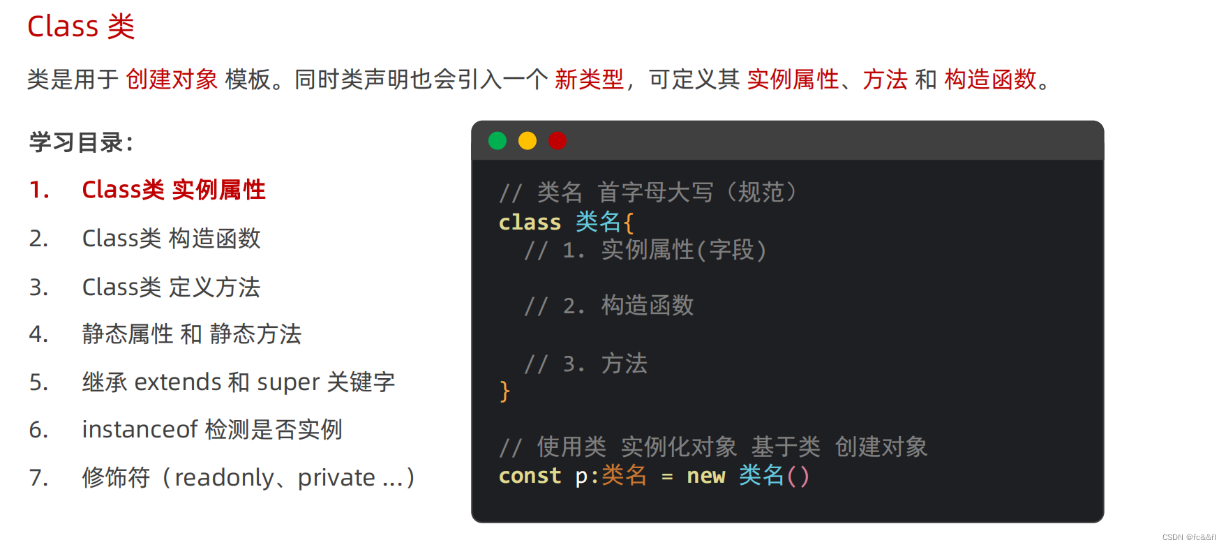
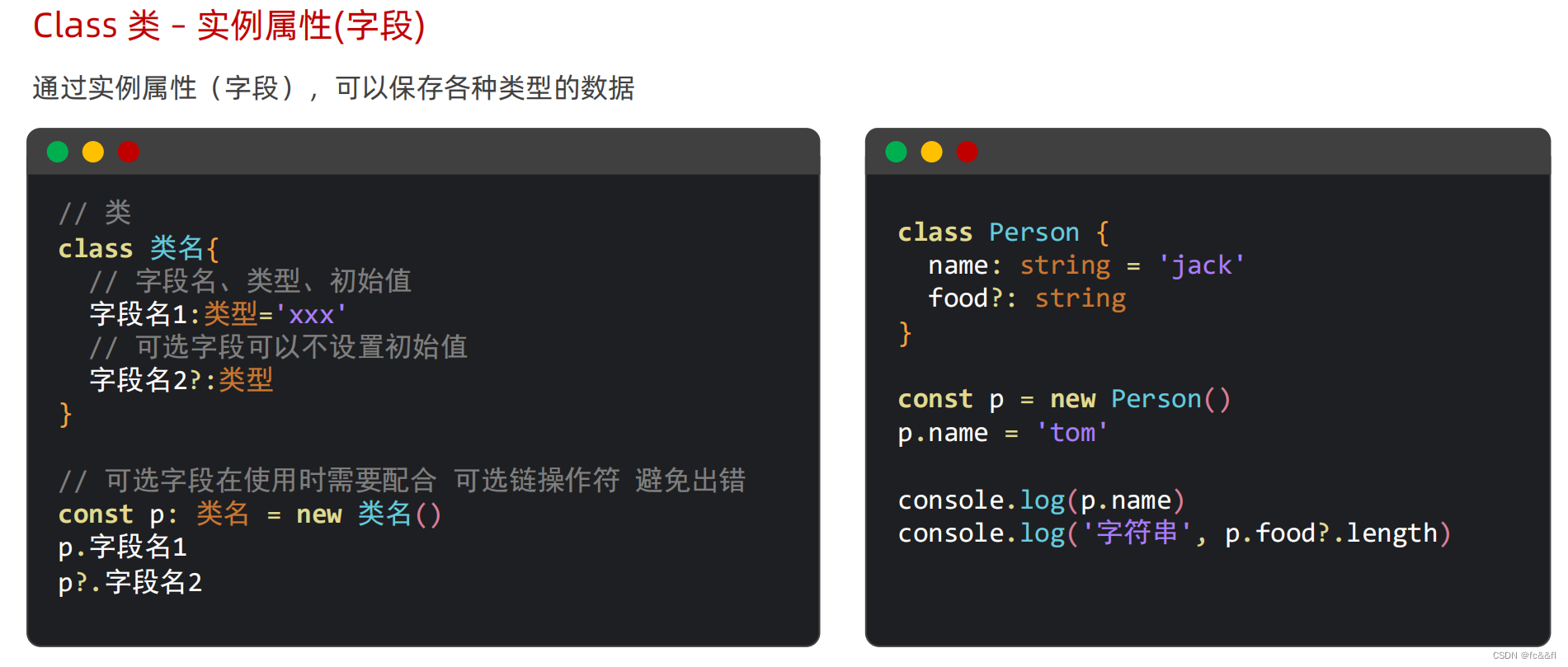
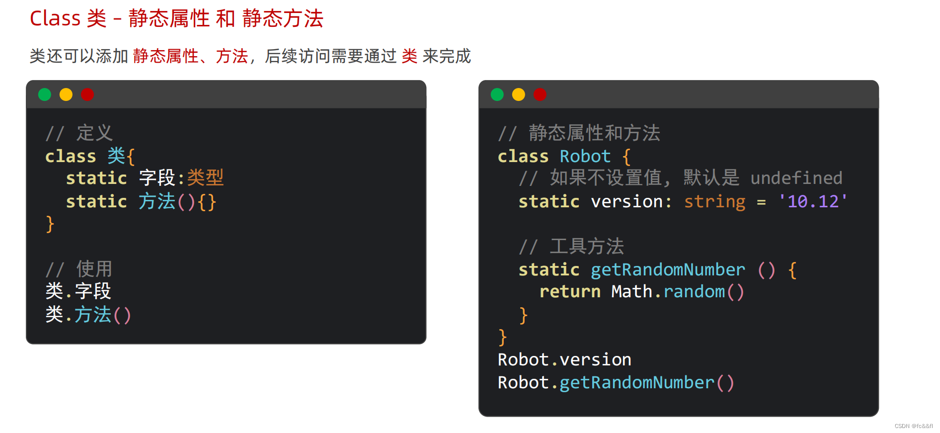
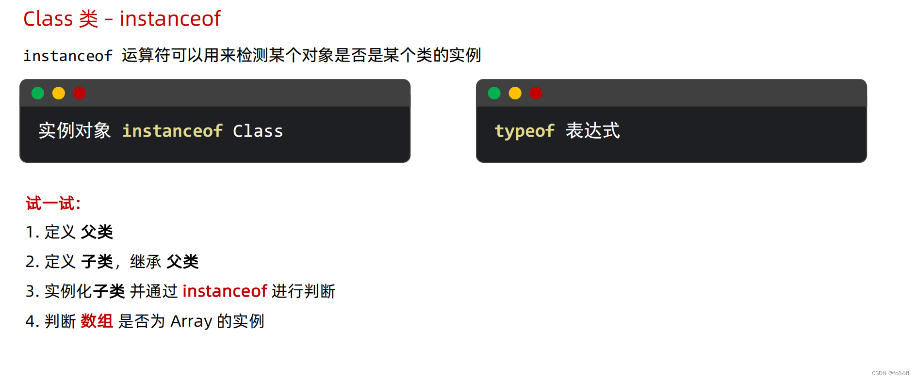
11.class类
静态属性和静态方法是给类本身加的,不是给实例加的
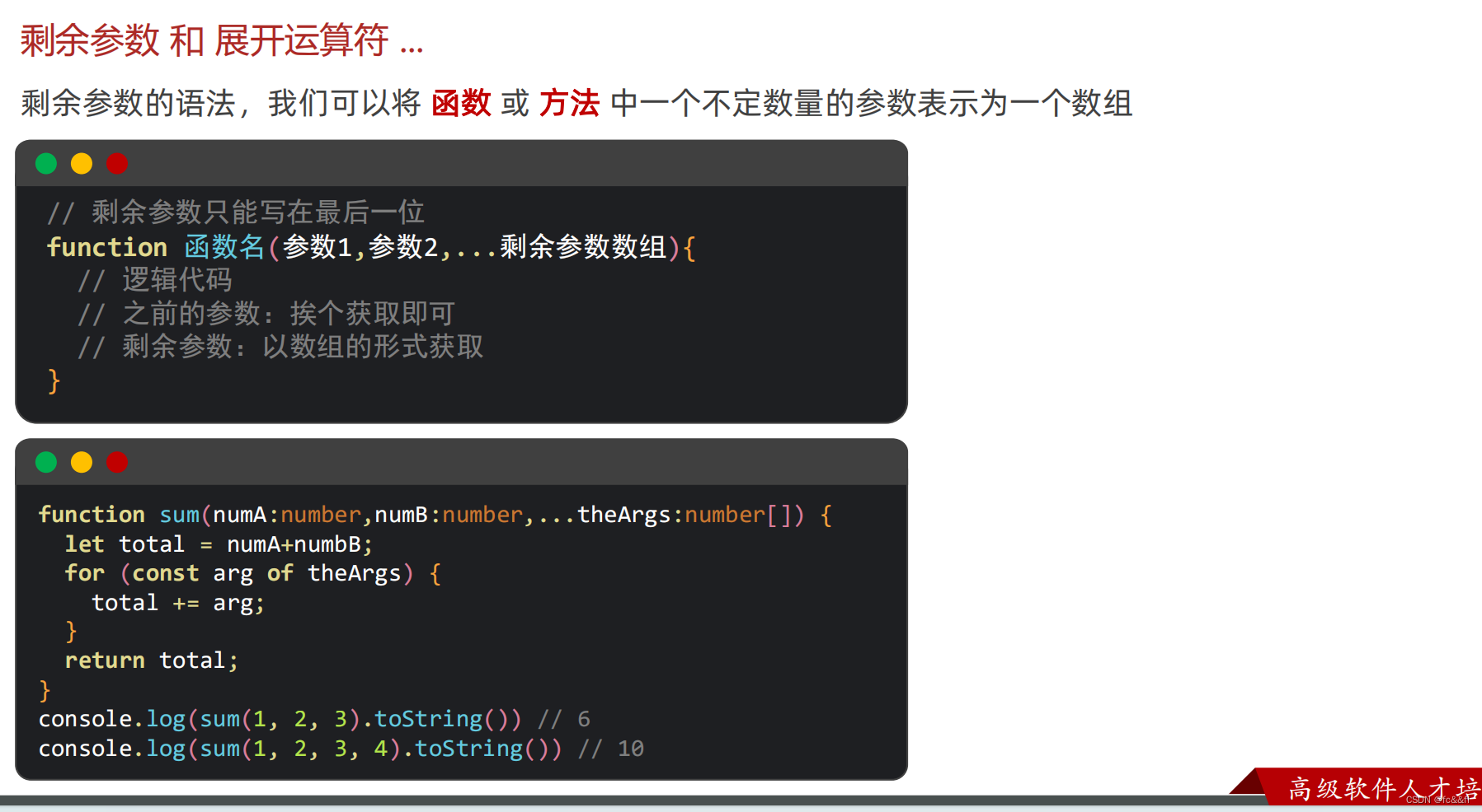
在 ArkTS 中 ...(展开运算符) 只能用在数组上
泛型约束,泛型接口,泛型类

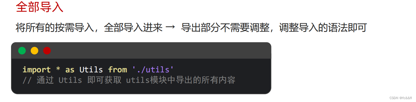
12.模块化


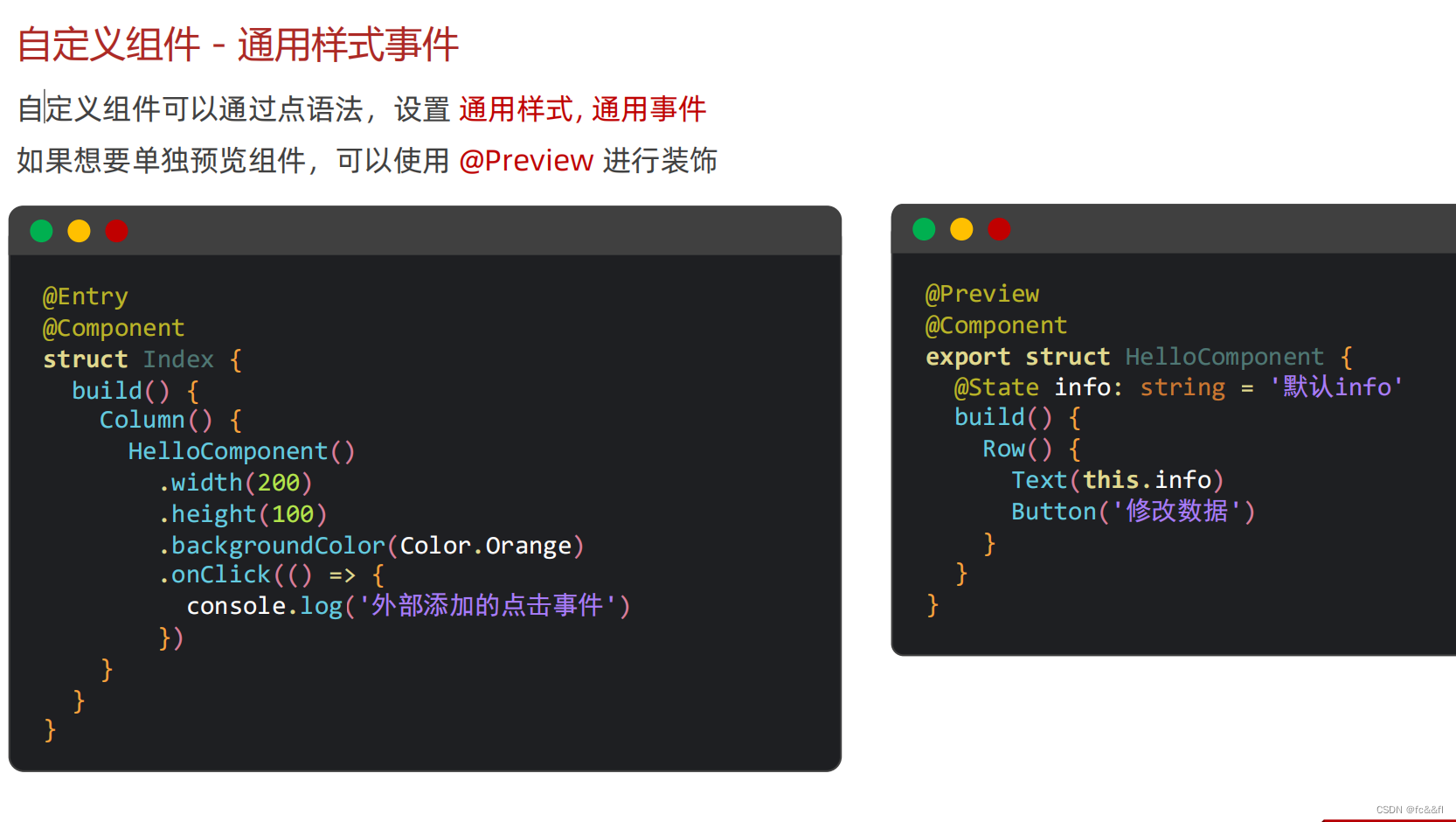
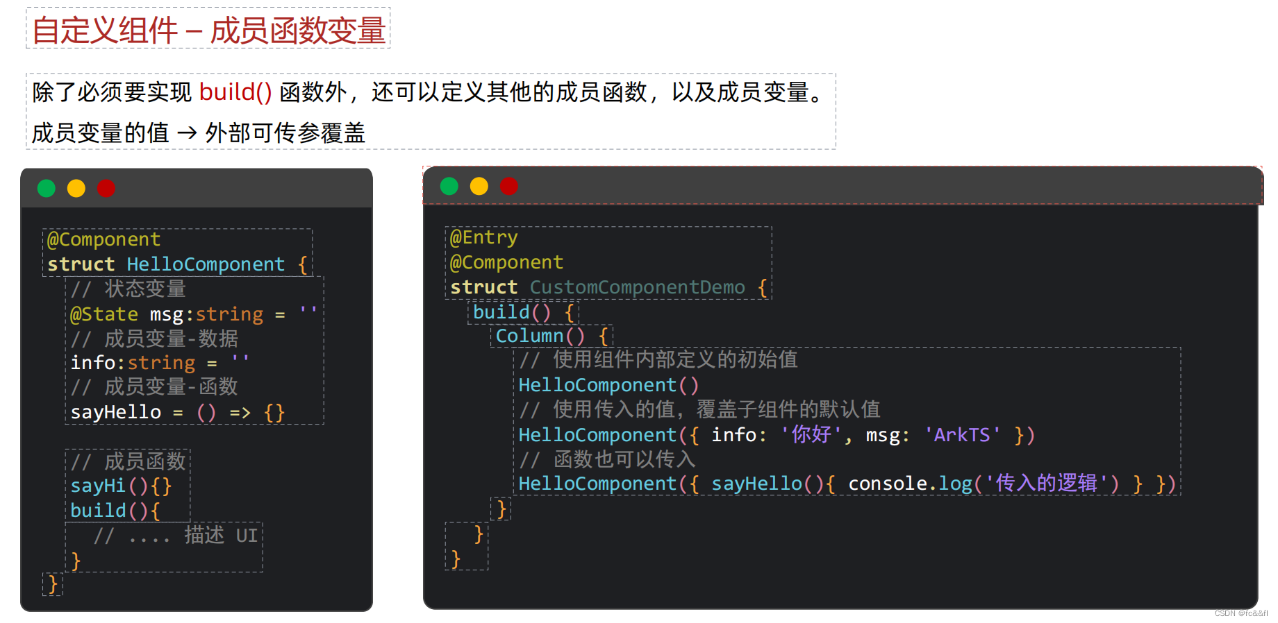
13.自定义组件

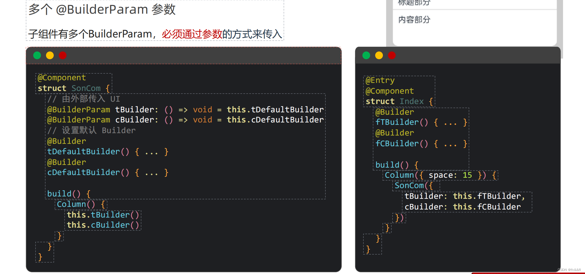
14. @BuilderParam传递UI

15.状态管理
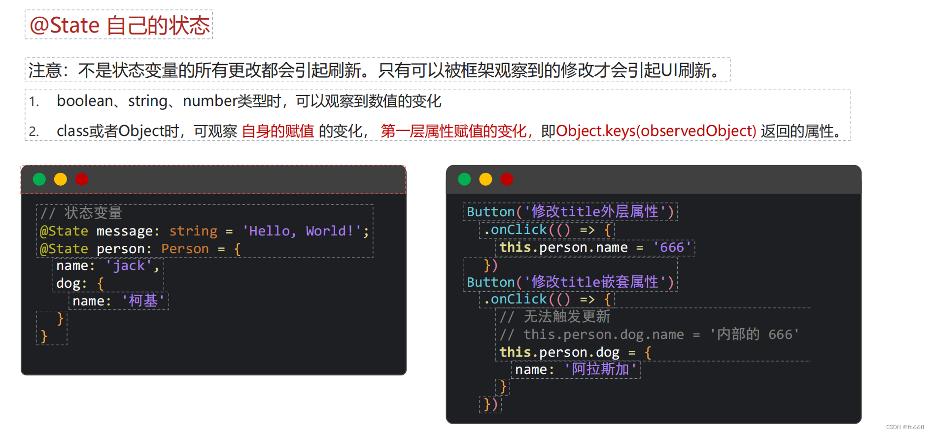

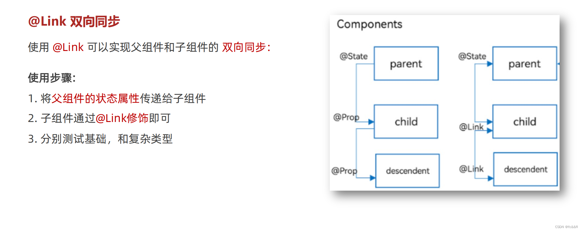
interface Person {
  name: string
  age: number
}

@Entry
@Component
  // 父组件
struct KnowledgePage {
  @State count: number = 0
  @State person: Person = {
    name: 'zs',
    age: 18
  }

  build() {
    Column() {
      Text('父组件')
        .fontSize(30)
      Text(this.count.toString())
      Text(JSON.stringify(this.person))
      Button('修改数据')
        .onClick(() => {
          this.count++
        })
      SonComponent({
        count: this.count,
        person: this.person
      })
    }
    .padding(10)
    .height('100%')
    .backgroundColor('#eee')
    .width('100%')
    .alignItems(HorizontalAlign.Center)
    .padding({ top: 100 })
  }
}


@Component
  // 子组件
struct SonComponent {
  @Link count: number
  @Link person: Person

  // 编写 UI
  build() {
    Column({ space: 20 }) {
      Text('我是子组件')
        .fontSize(20)
      Text(this.count.toString())
      Text(JSON.stringify(this.person))

      Column() {
        Button('修改数据')
          .onClick(() => {
            // this.count++
            this.person.age++
          })

      }

    }
    .backgroundColor('#a6c398')
    .alignItems(HorizontalAlign.Center)
    .width('80%')
    .margin({ top: 100 })
    .padding(10)
    .borderRadius(10)

  }
}
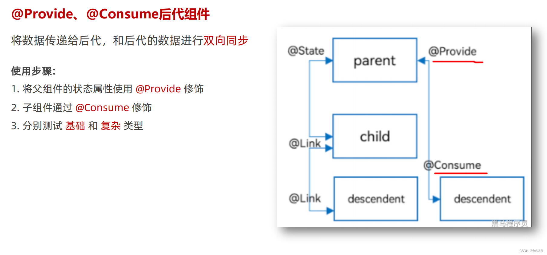
interface Car {
  name: string
  brand: string
}

@Entry
@Component
  // 顶级组件
struct RootComponent {
  @Provide themeColor: string = 'yellow'
  @Provide car: Car = {
    name: '小黄',
    brand: '美团'
  }
  build() {
    Column() {
      Text('顶级组件')
        .fontSize(30)
        .fontWeight(900)
      Text(this.themeColor)
      Text(JSON.stringify(this.car))

      // 二级组件
      ParentComponent()
      ParentComponent()
    }
    .padding(10)
    .height('100%')
    .backgroundColor('#ccc')
    .width('100%')
    .alignItems(HorizontalAlign.Center)
    .padding({ top: 100 })
  }
}


@Component
  // 二级组件
struct ParentComponent {
  @Consume themeColor: string
  // 编写 UI
  build() {
    Column({ space: 20 }) {
      Text('我是二级组件')
        .fontSize(22)
        .fontWeight(900)
      Text(this.themeColor)

      // 内层子组件
      SonComponent()
    }
    .backgroundColor('#a6c398')
    .alignItems(HorizontalAlign.Center)
    .width('90%')
    .margin({ top: 50 })
    .padding(10)
    .borderRadius(10)

  }
}

@Component
  // 内层组件
struct SonComponent {
  @Consume themeColor: string
  @Consume car: Car
  // 编写 UI
  build() {
    Column({ space: 20 }) {
      Text('我是内层组件' + this.themeColor)
        .fontSize(20)
        .fontWeight(900)
        .onClick(() => {
          // this.themeColor = 'orange'
          this.car.name = '小绿'
        })
      Text(JSON.stringify(this.car))
    }
    .backgroundColor('#bf94e4')
    .alignItems(HorizontalAlign.Center)
    .width('90%')
    .margin({ top: 50 })
    .padding(10)
    .borderRadius(10)

  }
}
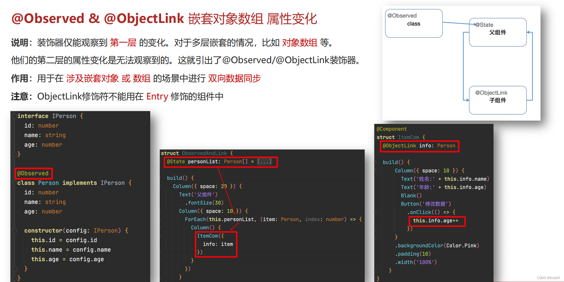
interface IPerson {
  id: number
  name: string
  age: number
}

@Observed
class Person {
  id: number
  name: string
  age: number

  constructor(obj: IPerson) {
    this.id = obj.id
    this.name = obj.name
    this.age = obj.age
  }
}


@Entry
@Component
struct ObservedAndLink {
  @State personList: Person[] = [
    new Person({
      id: 1,
      name: '张三',
      age: 18
    }),
    new Person({
      id: 2,
      name: '李四',
      age: 19
    }),
    new Person({
      id: 3,
      name: '王五',
      age: 20
    })
  ]

  build() {
    Column({ space: 20 }) {
      Text('父组件')
        .fontSize(30)
      List({ space: 10 }) {
        ForEach(this.personList, (item: Person, index: number) => {
          ItemCom({
            info: item,
            addAge: () => {
              // 修改嵌套的数据 => 普通的情况, 监视不到更新
              item.age++ // 如果能监视到
              AlertDialog.show({
                message: JSON.stringify(this.personList)
              })
              // this.personList.splice(index, 1, item) // 无需手动替换更新
            }
          })
        })
      }

    }
    .backgroundColor('#cbe69b')
    .width('100%')
    .height('100%')
    .padding(20)
  }
}

@Component
struct ItemCom {
  @ObjectLink info: Person
  addAge = () => {

  }

  build() {
    ListItem() {
      Row({ space: 10 }) {
        Text('姓名:' + this.info.name)
        Text('年龄:' + this.info.age)
        Blank()
        Button('修改数据')
          .onClick(() => {
            // this.addAge()
            this.info.age++
          })
      }
      .backgroundColor(Color.Pink)
      .padding(10)
      .width('100%')
    }
  }
}
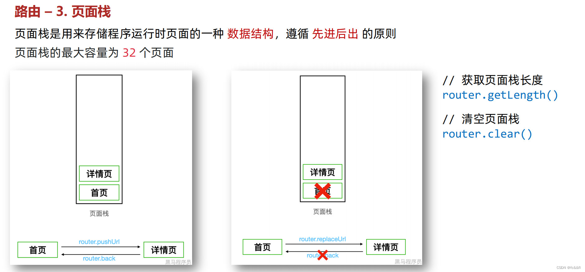
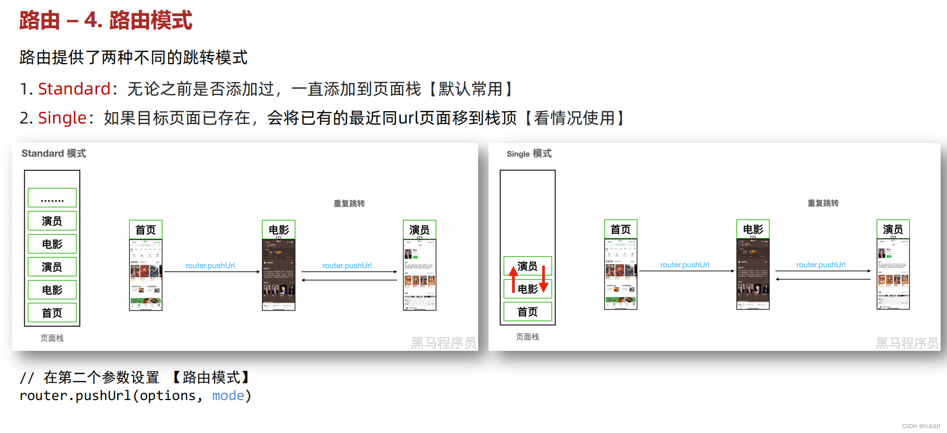
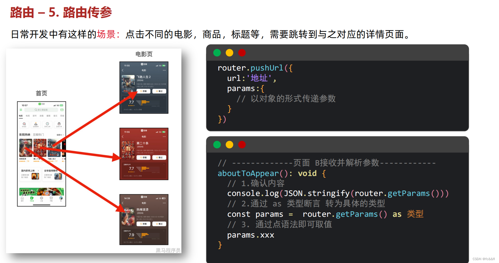
16.路由
页面路由指的是在应用程序中实现 不同页面之间的跳转,以及数据传递。


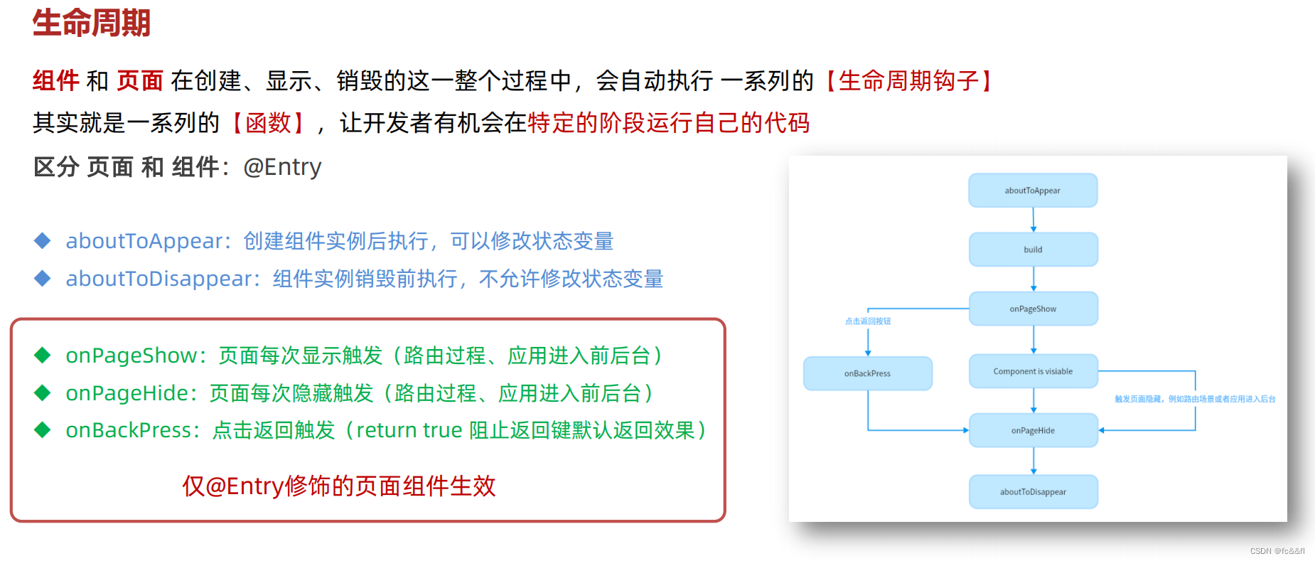
16.生命周期
17. 打包
鸿蒙ArsTS项目创建打包发布流程_arkts 如何打包成app-CSDN博客
文章内容总结于
01-环境备选方案-API10-开发工具下载_哔哩哔哩_bilibili